CSS for JS Developers 学习笔记 (M2 Positioning - 3 Styled-Components)
date
Dec 27, 2023
slug
learn-css-for-js-developers-1
status
Published
tags
CSS
summary
type
Post
Module 2 Rendering Logic IIAbsolute Positioning 绝对定位定位方式Containing Blocks 包含块继承Stacking Contexts 层叠上下文层叠元素的渲染规则:渲染两步走,先非定位,后定位 z-index:只对定位元素生效,创建层叠上下文(局部)调试层叠上下文:Stacking Contexts InspectorManaging z-index 管理 z-indexisolation: 最简单无痛地创建层叠上下文Portals 门户 (React/Vue/Angular/Svelte)Fixed Positioning 固定定位The transform exception实用 js 脚本:找到 fixed 不生效的罪魁祸首Overflow 溢出默认值autohidden溢出陷阱:滚动容器水平滚动绝对定位和固定定位的元素也有溢出吗?Sticky Positioning 粘性定位简单理解很酷的滚动效果overflow 对 sticky 的影响实用 js 脚本:找到 sticky 不生效的罪魁祸首紧靠视口边缘的小数像素舍入Hidden Content 隐藏内容display:nonevisibility: hiddenopacity: 0Workshop: Character Creatornegative margin: 清除父元素的 padding, 补上自己的 paddingModule 3 Modern Component Architecturestyled-components 101& 选中自己另一种写法:CSS propInstallation and Setup 安装和设置Babel 插件Server-side RenderingGlobal Styles 全局样式Dynamic Styles 动态样式Inline stylesCamel-case propertiesInterpolation functions 插值函数(推荐)CSS Variables CSS变量附:简单的媒体查询例子Component Libraries 组件库Design systems and design tokens对现成组件库的看法及本节目标BreadCrumbs 面包屑导航关键字:revert伪类 :not 和 :first-of-type伪元素 ::before (:before)完整代码Button 按钮 with Variants 变体 & States 状态Composition 样式组合 | 使用 styled() 扩展已有组件的样式使用 CSS 变量实现不同状态使用样式组合实现不同变体完整代码Dynamic Tags / Link Button 按钮链接as 多态Escape Hatches 逃生舱styled() 扩展任意组件的样式对逃生舱的看法Single Source of Styles 单源样式样式的反向嵌套
Module 2 Rendering Logic II
Absolute Positioning 绝对定位
定位方式
绝对定位的元素在布局时会相对于其最近的定位祖先元素进行定位。如果没有已定位的祖先元素,它将相对于初始包含块进行定位。
定位:
relative, absolute, fixed, sticky 均可。只要不是 static
绝对定位的元素在定位时不考虑父元素的 padding。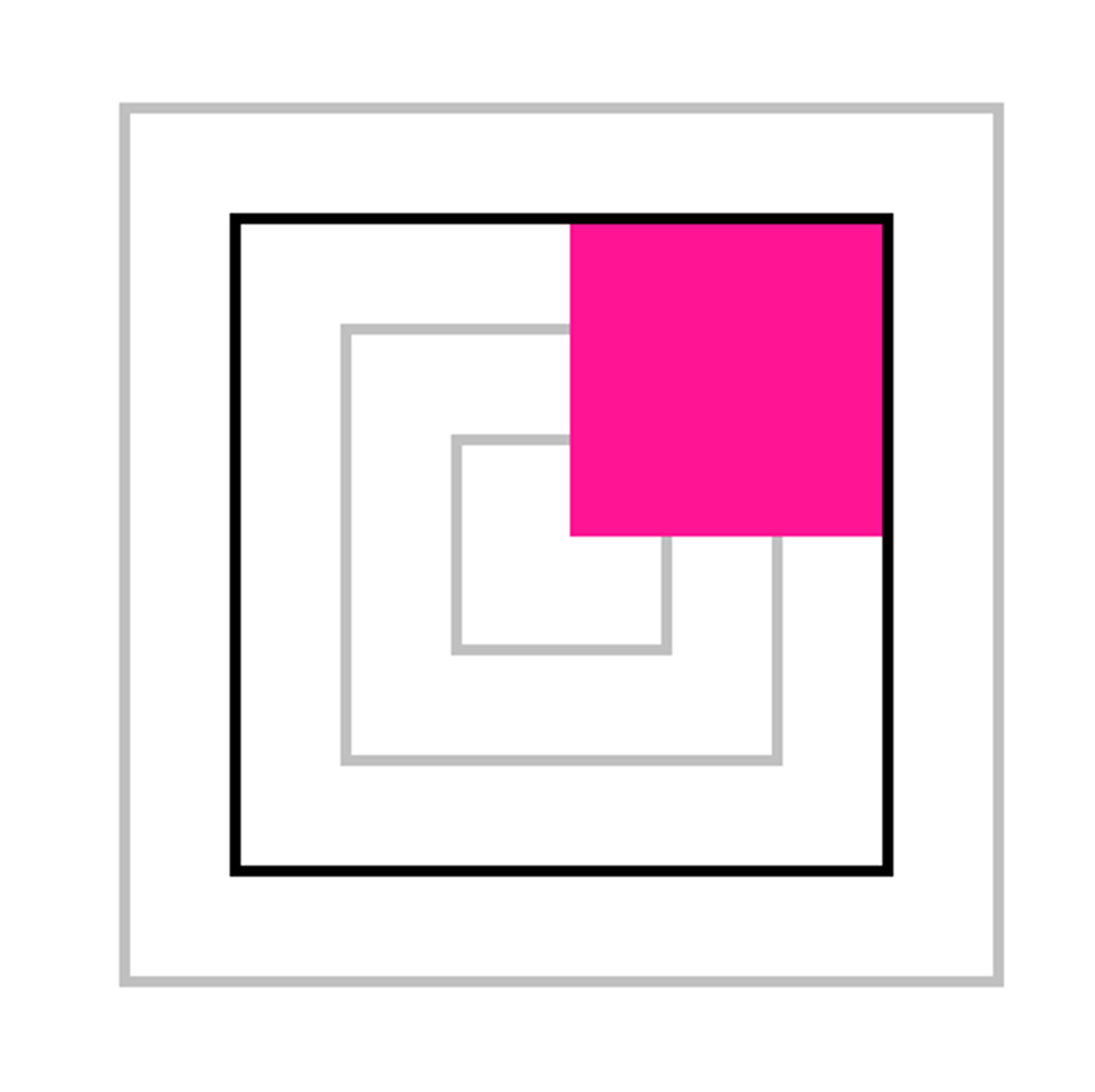
Containing Blocks 包含块
继承
Stacking Contexts 层叠上下文
层叠元素的渲染规则:渲染两步走,先非定位,后定位
As a general rule, positioned elements will always render on top of non-positioned ones.
We can think of it as a two-stage process: first, all of the non-positioned elements are rendered (everything using Flow, Flexbox, Grid…). Next, all of the positioned elements are rendered on top (relative, absolute, fixed, sticky).
z-index:只对定位元素生效,创建层叠上下文(局部)
即使
.tooltip 的 z-index 为 99999,因为 <main> 的 z-index 比 <header> 低,最终结果还是 .tooltip 在下面.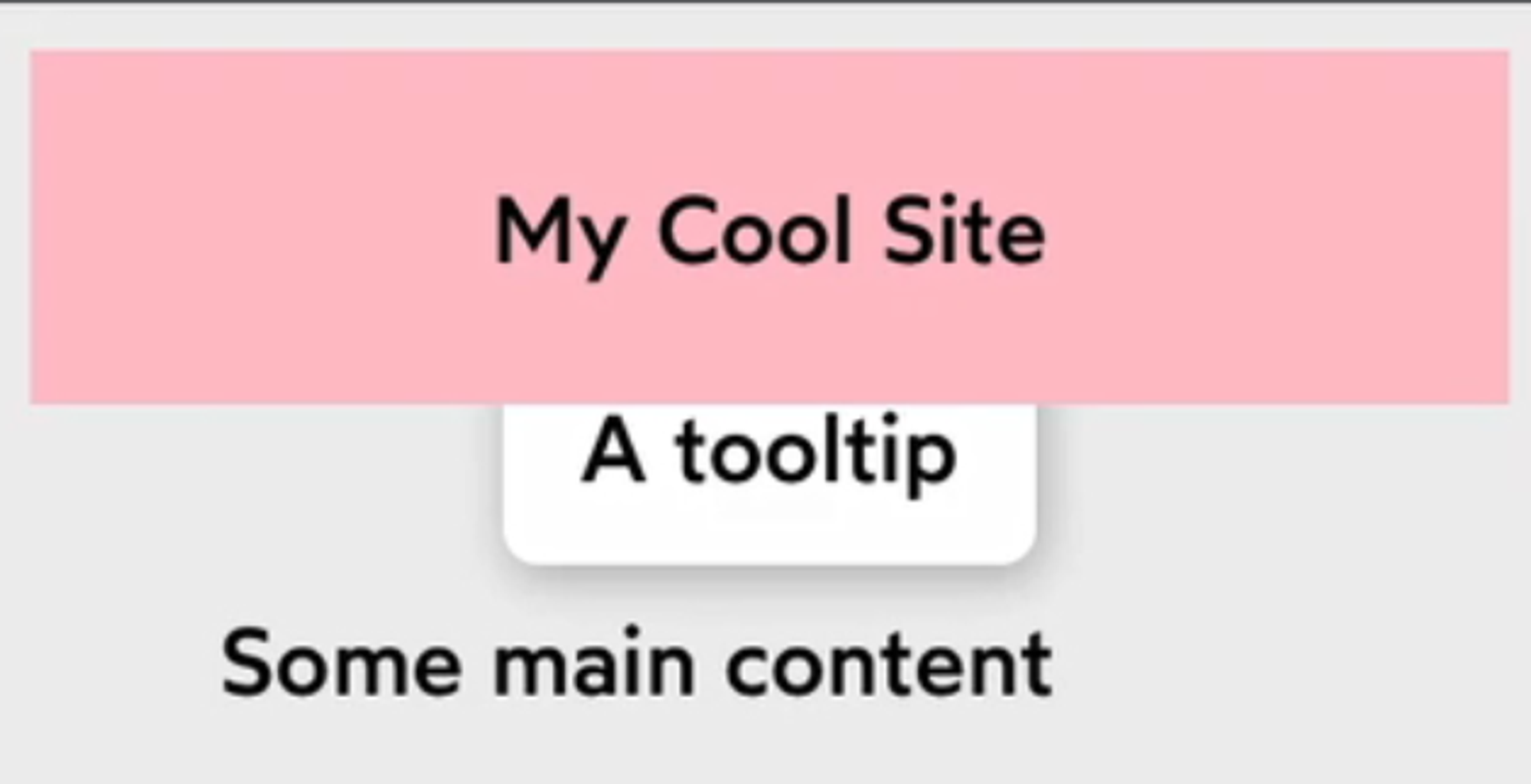
注意:不指定 z-index 时,默认为
z-index: auto; 此 auto 值默认情况下确实是 0。然而,显式指定
z-index: 0; 会创建新的层叠上下文,auto 不会。所以,将上面代码中
main 的 z-index 改为 0,没有任何改变。若删去此行,.tooltip和<header> 会处于同一个层叠上下文中,它们的z-index值直接比较,所以.tooltip就覆盖在<header>上面了。调试层叠上下文:Stacking Contexts Inspector
stacking-contexts-inspector
andreadev-it • Updated Feb 28, 2024


Managing z-index 管理 z-index
isolation: 最简单无痛地创建层叠上下文
当我们想让中间的卡片突出显示时…
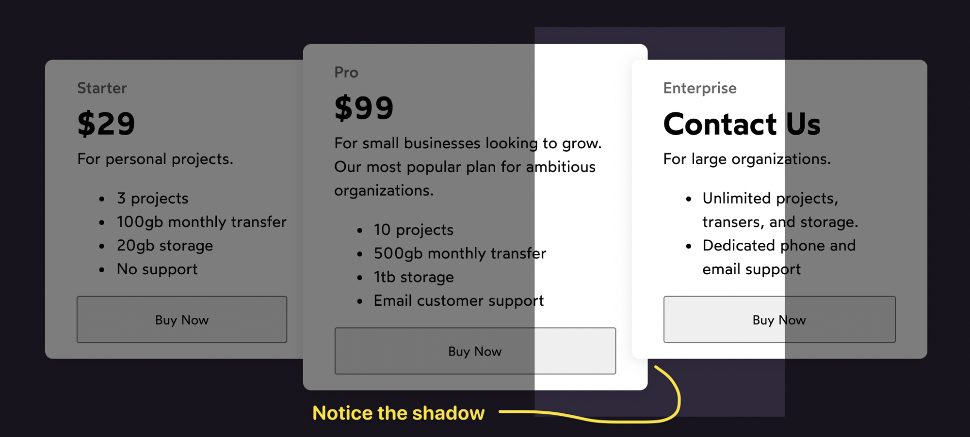
给中间的卡片提升一下 z-index:
不巧的是,header 的 z-index 恰好和中间卡片的相等,又高于两边的卡片,向上滚动页面时,它将从卡片间的缝隙中穿插过去。
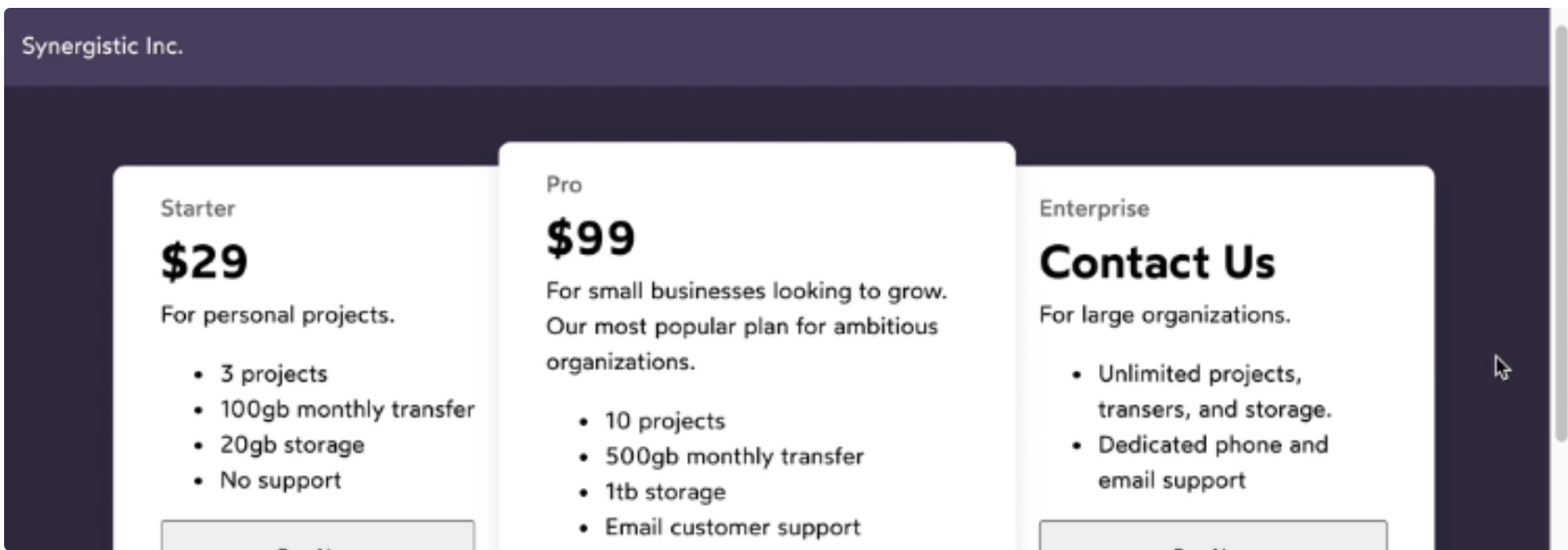
一种简单的解决方法是给这个
pricing wrapper 创建一个层叠上下文:这当然可行,但更合适的解决方法是:
The
isolation property does precisely 1 thing: creates a stacking context.It has the same effect of flattening all of the child elements, but it does so without requiring that we also set a
z-index on the parent. It's the lightest-touch way to create a stacking context.Portals 门户 (React/Vue/Angular/Svelte)
(回顾这部分建议再看看视频)
Portal 的作用是将子组件渲染到存在于父组件 DOM 层次结构之外的 DOM 节点中,例如
<div id="root"> 之外。考虑实际问题: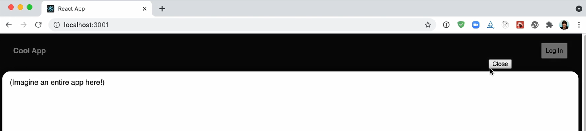
header 的登录按钮:点击后,弹出的 Login Modal 被 Main 挡住了。
Josh 建议使用 Reach UI 解决这种问题。
Fixed Positioning 固定定位
The transform exception
In general, fixed elements will be positioned relative to the viewport, but there is one exception.
If a parent or grandparent uses the
transform property, it becomes the containing block for the fixed element, essentially transforming it into an absolutely-positioned element.For now, the thing to remember is that transformed parents can't have fixed children.
Also, the
will-change: transform declaration has the same effect例如,在下面的 codepen 中,实心盒子会随着页面滚动而滚动,原因是它的祖先元素
<section> 被设置了will-change: transform;
实用 js 脚本:找到 fixed 不生效的罪魁祸首
Once you find the element(s) in question, you can try removing the properties, or finding a non-transform alternative. If this isn't possible, you should consider moving the fixed element into a portal, as we discussed earlier.
Overflow 溢出
默认值
默认值
visible 如图: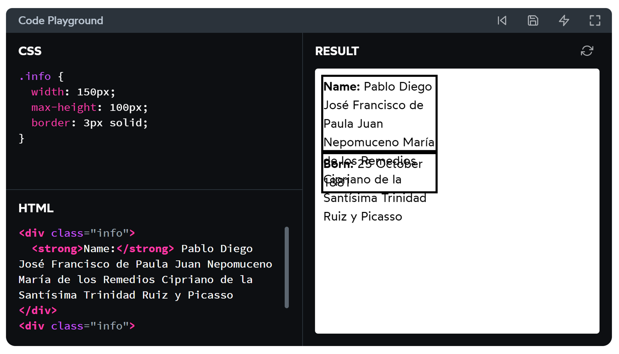
auto
auto 很智能,当我们预计某个容器里的内容可能发生溢出时,写
overflow: auto 可以理想地为其添加 overflow-y: scroll 或 overflow-x: scroll 或两者。hidden
截断溢出的内容。
作用:
- 用省略号截断溢出的文本。
- 装饰效果。
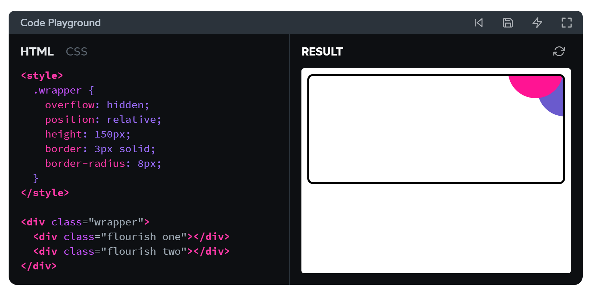
溢出陷阱:滚动容器
当我们指定either
overflow-x or overflow-y 时,这个元素将成为滚动容器。对于以下例子:
x方向上,如我们所料,右半圆被隐藏了,也没有滚动条;
y方向上,我们明明设置了
visible 以让下半圆正常溢出,但实际结果是,它居然像 scroll 一样工作。Here's a neat bit of trivia: 当我们设置
overflow: hidden 时,我们实际上做的是移除滚动条。本质上,overflow: hidden 是一个没有滚动能力的 overflow: scroll 容器。我们被允许为
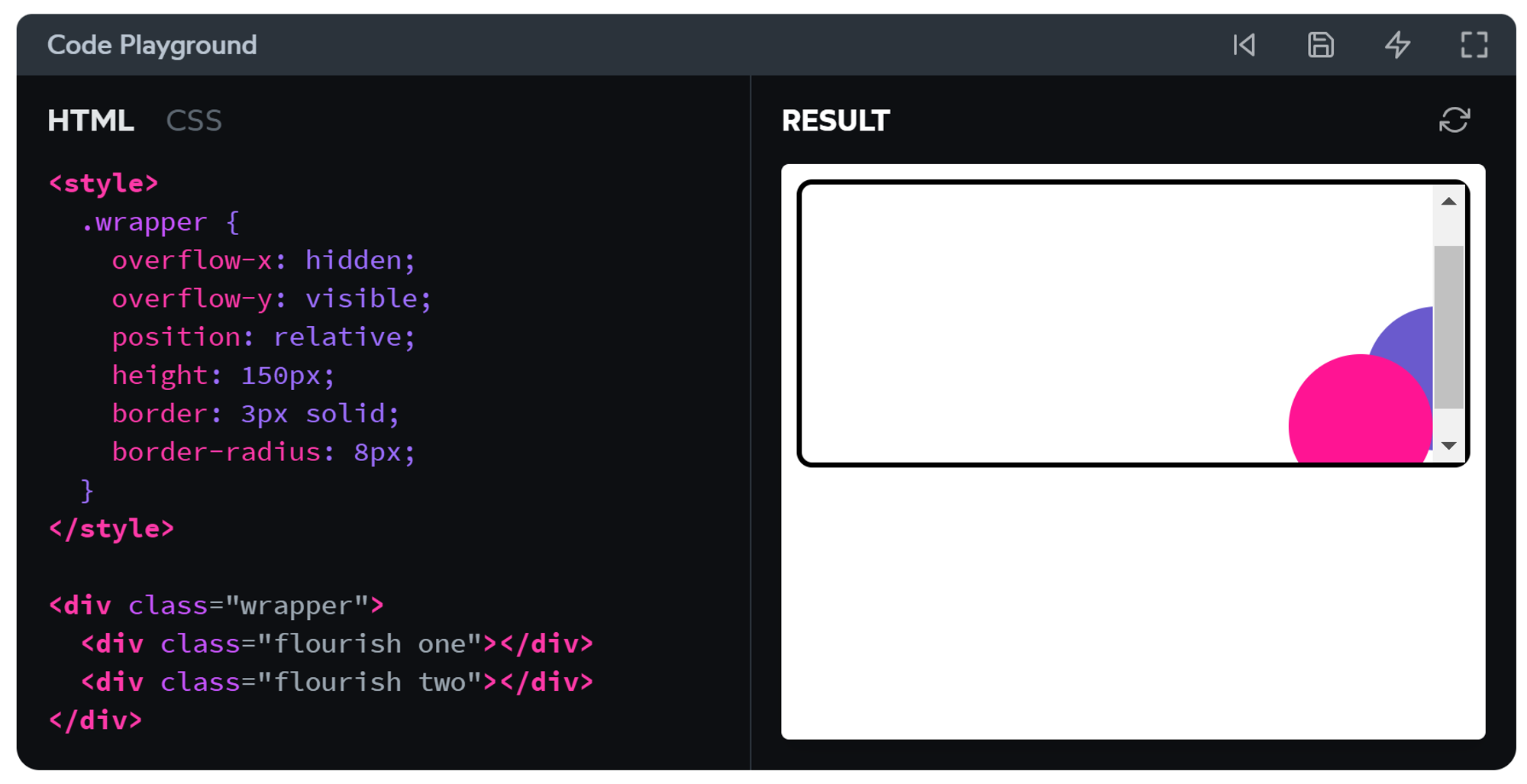
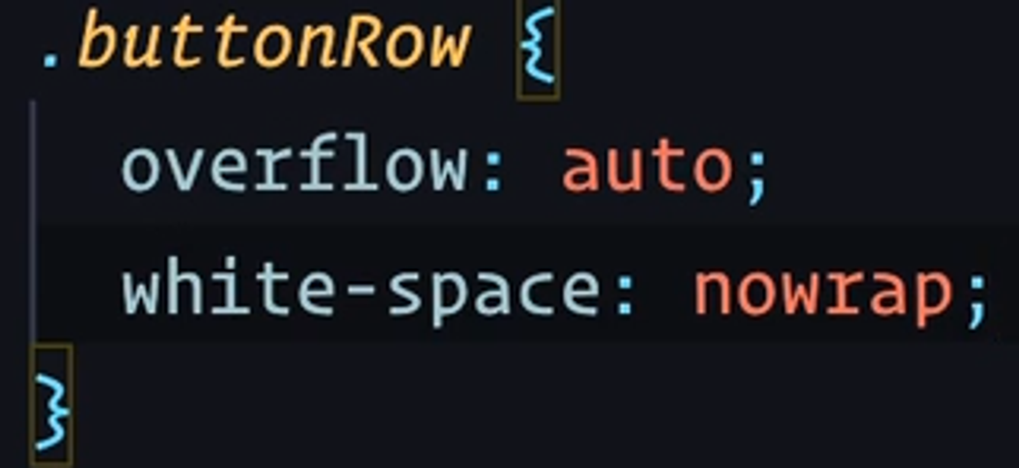
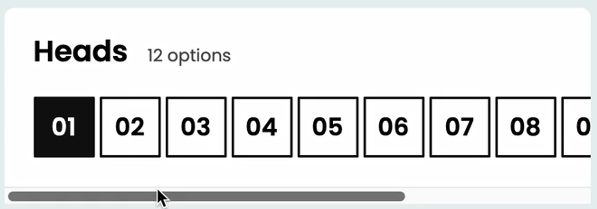
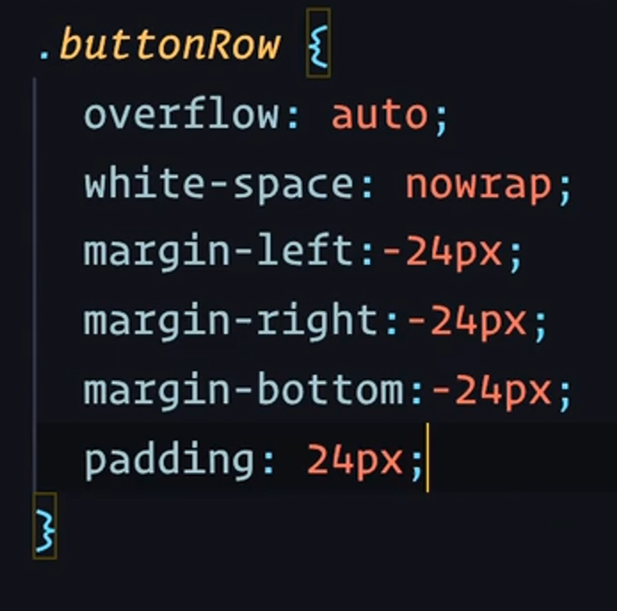
overflow-x 和 overflow-y 设置不同的值,只是为了在需要时能够使一个轴向隐藏而另一个轴向可滚动,并不能用于实现一个轴向上的”正常可见”溢出。水平滚动
注:当一些 inline 元素并排挤在 block 元素中时,自动换行是它们的默认行为。
通过设置
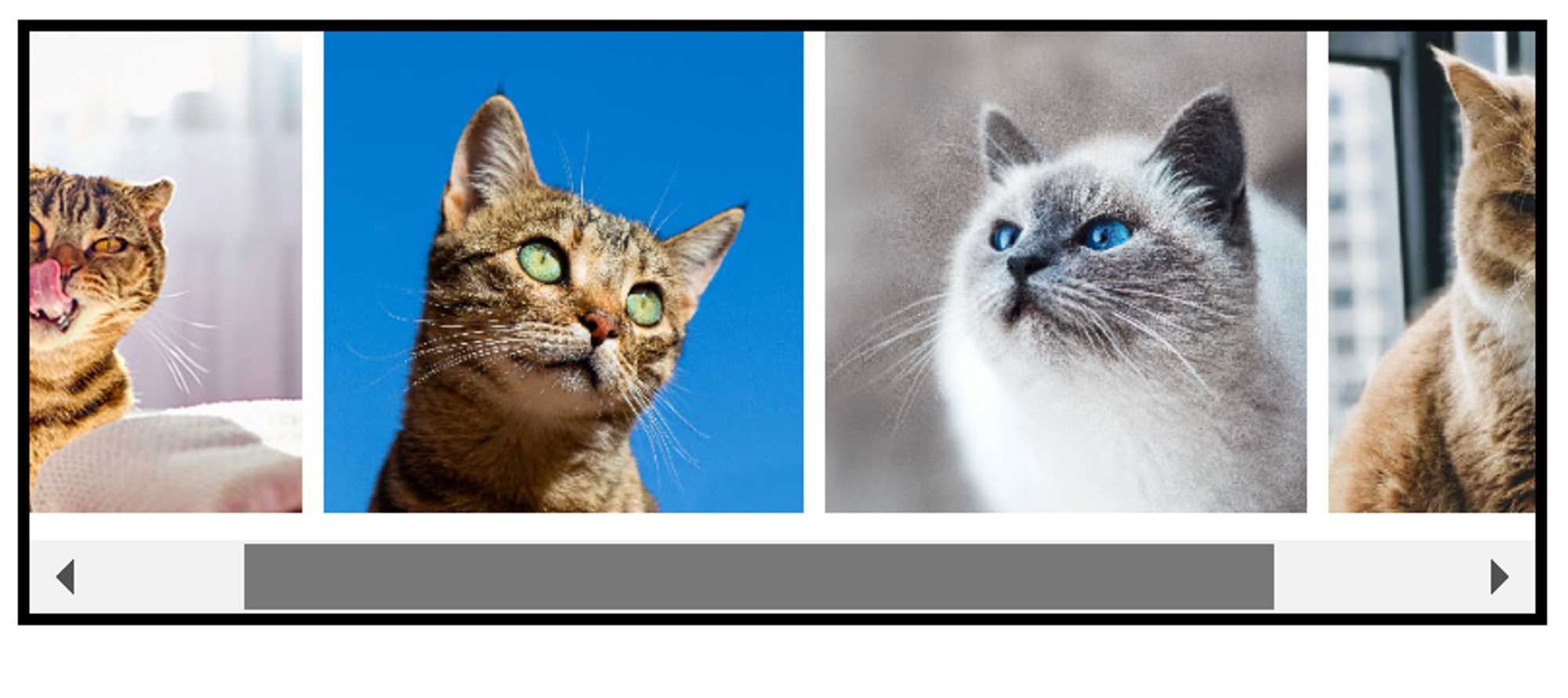
overflow: auto; + white-space: nowrap;, 我们就可以实现水平滚动的元素。绝对定位和固定定位的元素也有溢出吗?
有,但是相对于它们的包含块。
给
.wrapper 添加 position: relative; 后,粉色 box 就被限制住了。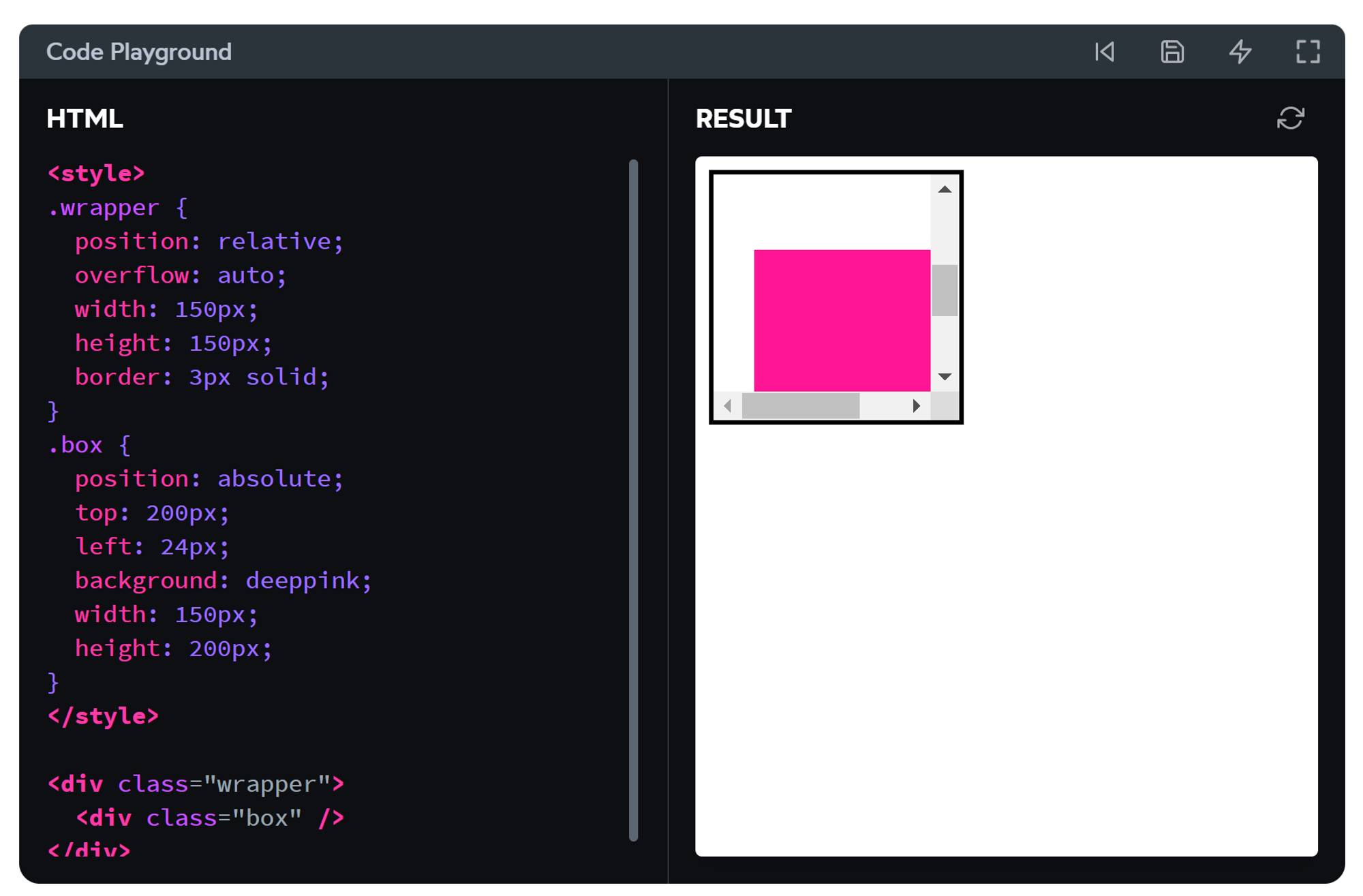
如果包含块设置了
overflow: auto ,它将允许绝对定位的元素滚动到视野范围内。不过,当 .box 的 position 为
fixed 时,情况会变成这样: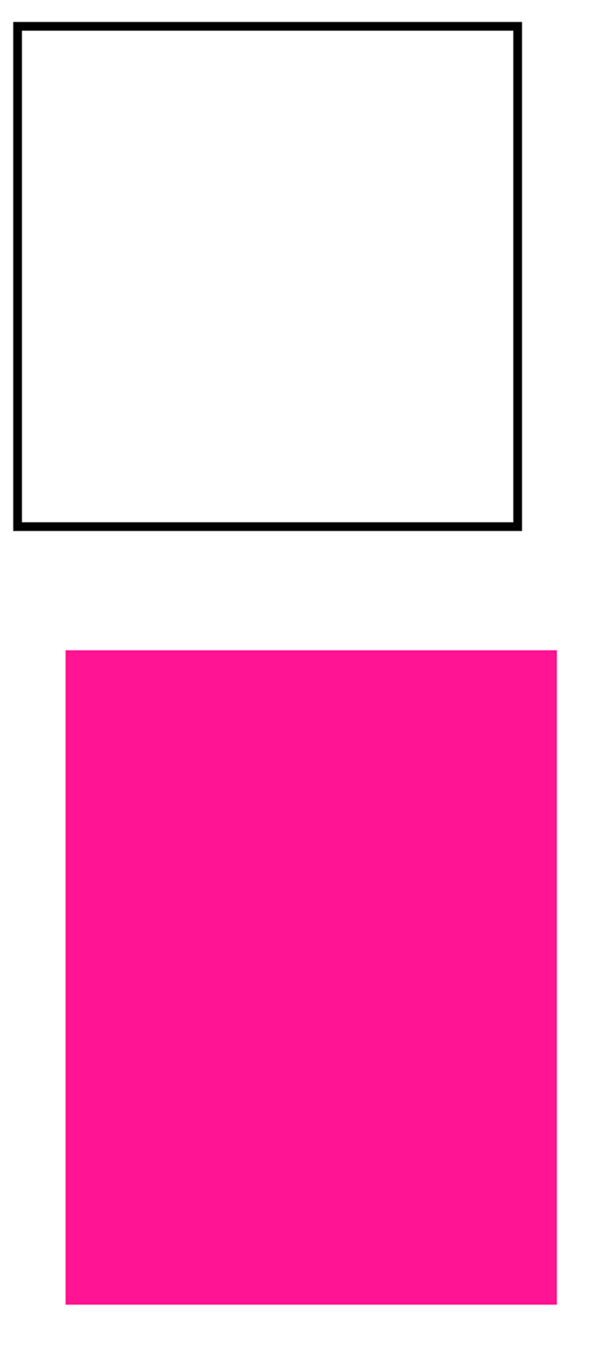
考虑笔记前文中的包含块:
fixed 元素的包含块始终是 viewport. wrapper “包不住”它。同理,将 wrapper 的 overflow 设为
hidden 也是无效的,结果和上图一样。Sticky Positioning 粘性定位
简单理解
在到达边界前,元素是相对定位的(不脱离文档流);之后,它变成了固定定位。因此需要至少指定一个边界,例如
top: 0;由于元素是相对定位,它不会跑出父元素的边界。当父元素随着滚动在视口中消失时,它也会跟着消失。
很酷的滚动效果
每个 heading 都像知道我们看到哪里了一样,跟随本段文章,在进入下一段文章前消失。
给每个 section 添加一个 border 就能知晓其中端倪。
overflow 对 sticky 的影响
When we set
overflow to something like hidden or scroll or auto, we're essentially saying that the sticky element should stick in that context, not in the broader page context.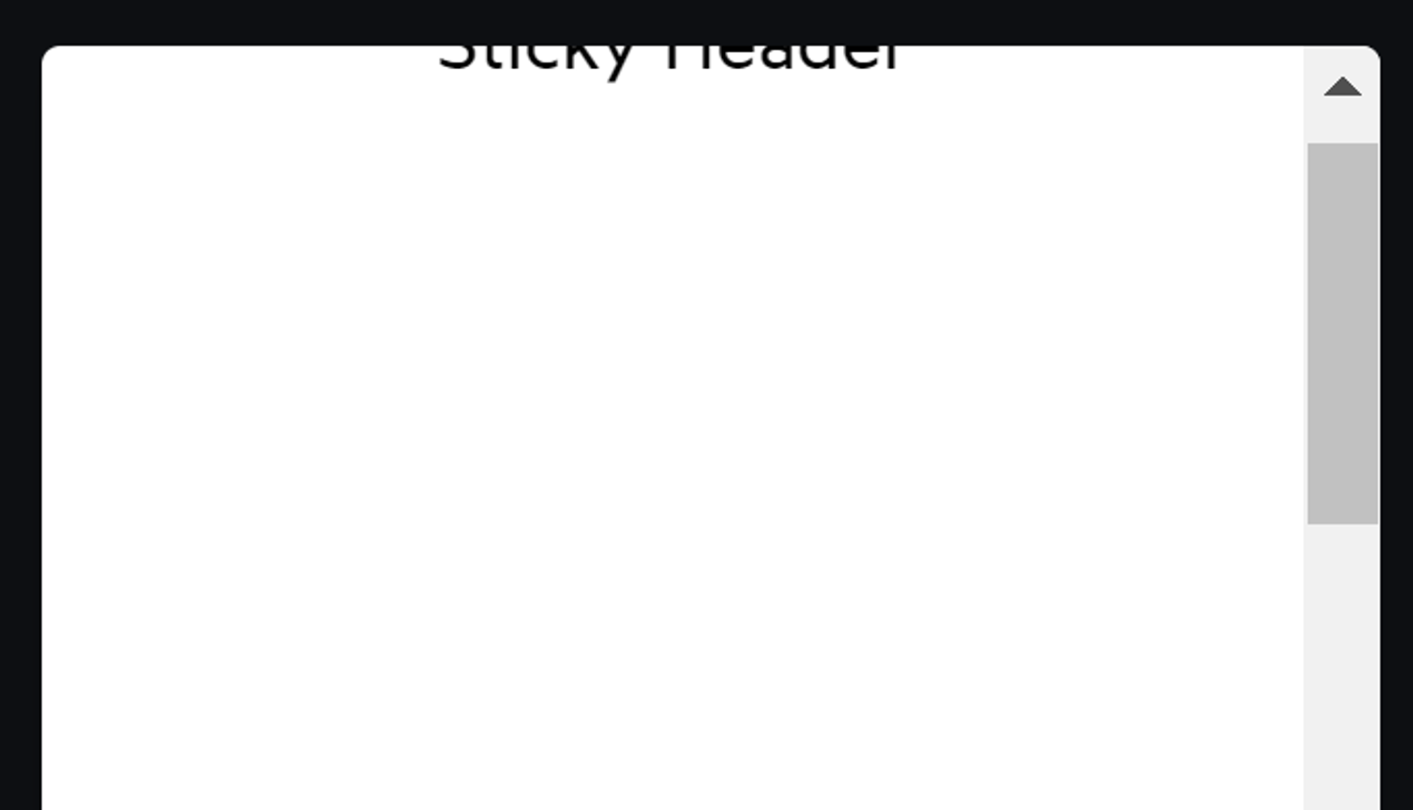
如上图,因为 <main> 设置了
overflow: auto , sticky header 现在只听 <main> 的话。只有当 <main> 能滚动时(而不是 viewport),它才会粘住。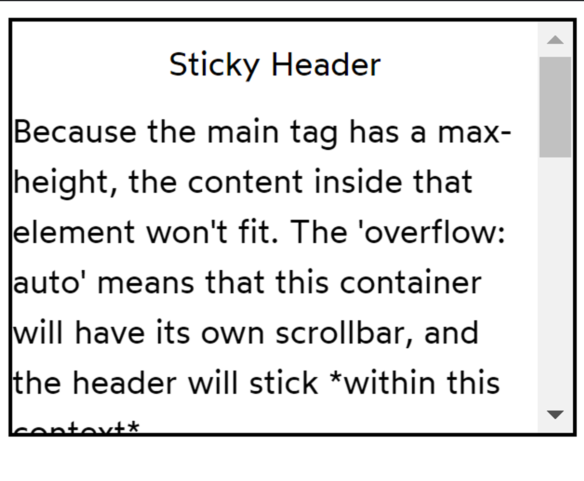
现在,<main> 有了 max-height,而main中的内容又超过了这个高度。由于
overflow: auto 的作用,<main> 自己将出现滚动条。实用 js 脚本:找到 sticky 不生效的罪魁祸首
紧靠视口边缘的小数像素舍入
If you intend for an element to sit right against the edge of the viewport, you might discover a thin 1px gap between the element and the edge in Chrome.
This is a rounding issue with fractional pixels. I've solved this issue by insetting the sticky element by a single pixel:
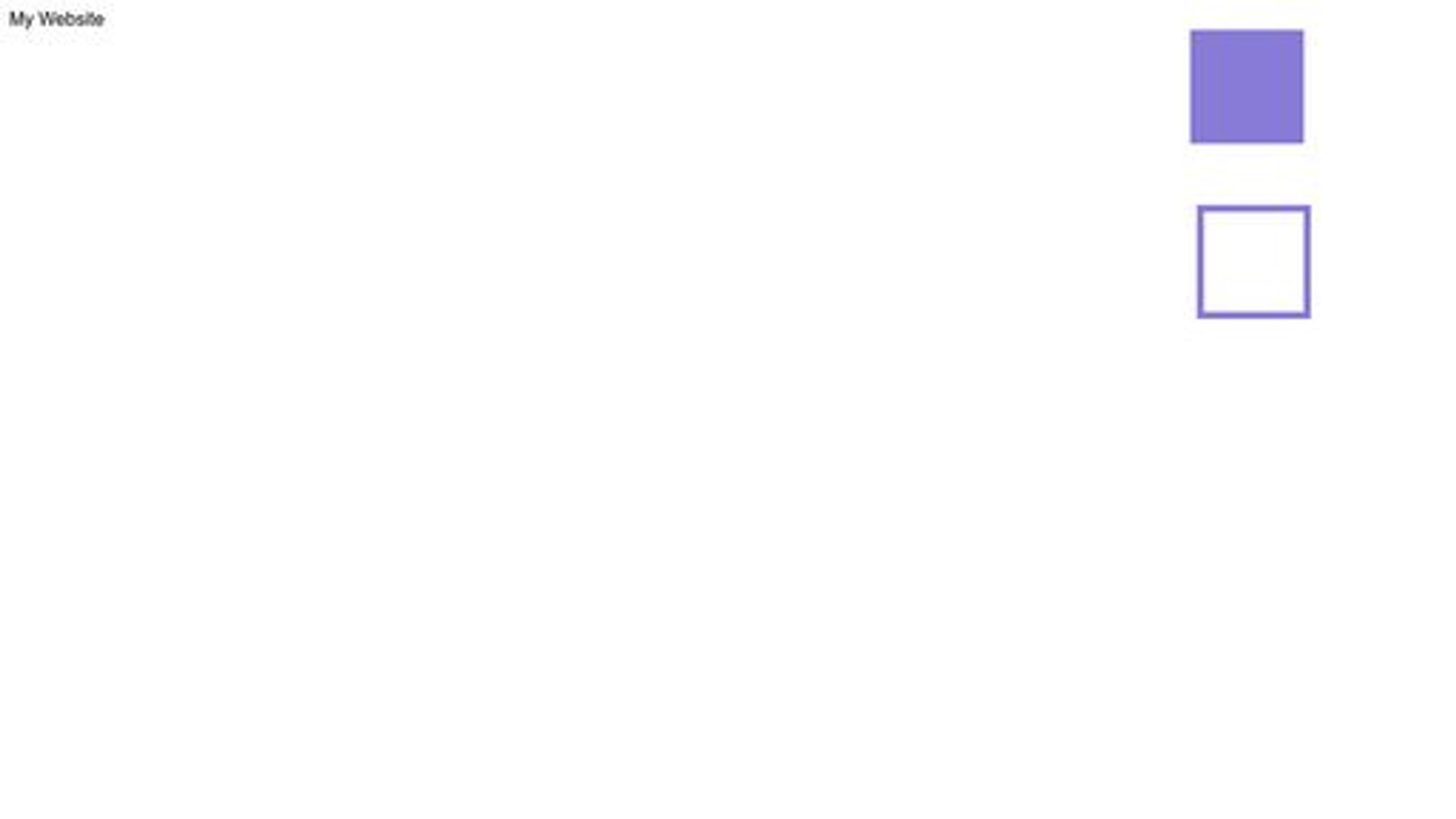
Hidden Content 隐藏内容
display:none
从 DOM 中移除,不占位,无法被点击或聚焦。
visibility: hidden
占位,即使看不见,也能控制父元素的layout.
在三种方法中,仅此方法可实现:父元素隐藏,子元素不隐藏
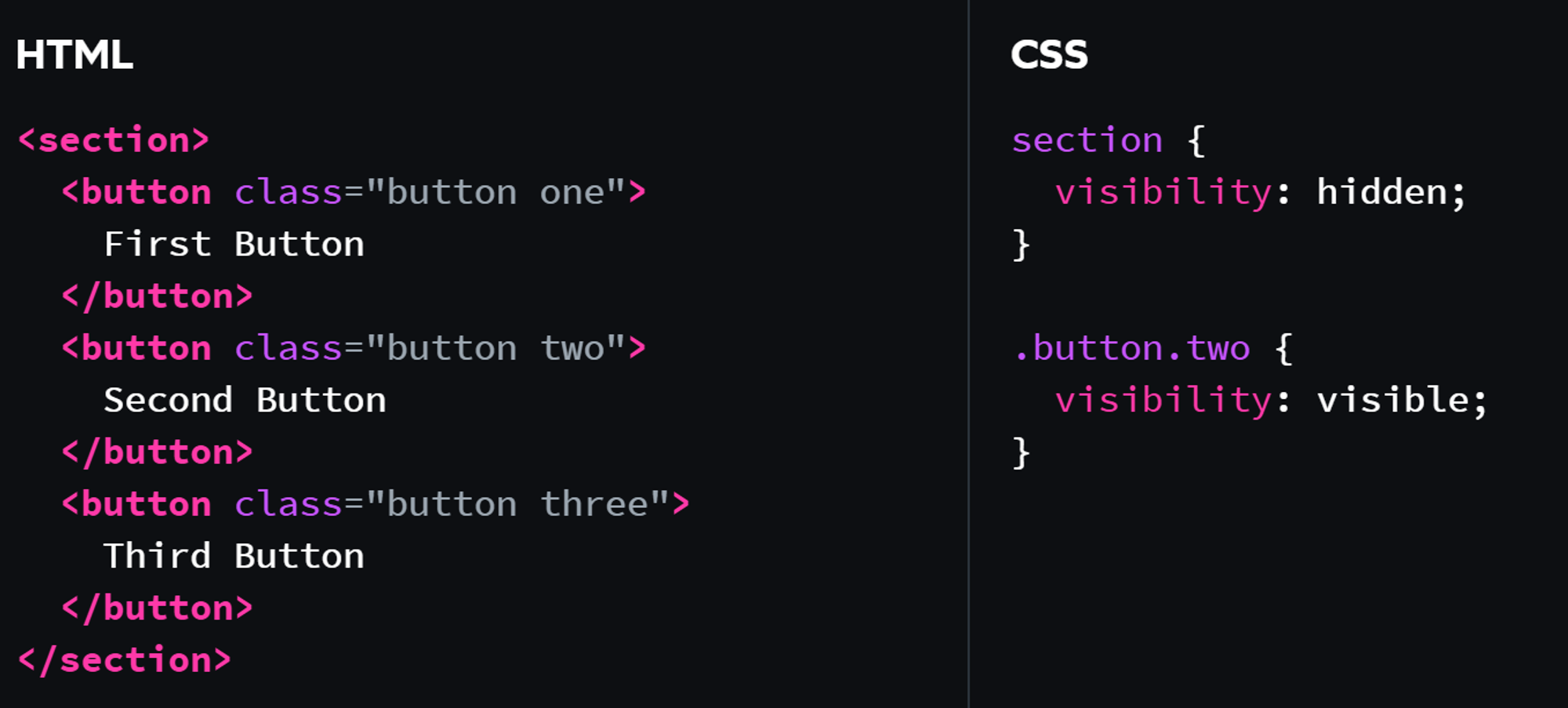
显示第二个按钮,第一和第三个按钮被隐藏。
opacity: 0
占位,按钮能点击,文字能选中,表单能聚焦。
Workshop: Character Creator
negative margin: 清除父元素的 padding, 补上自己的 padding
Module 3 Modern Component Architecture
styled-components 101
& 选中自己
output:
另一种写法:CSS prop
Installation and Setup 安装和设置
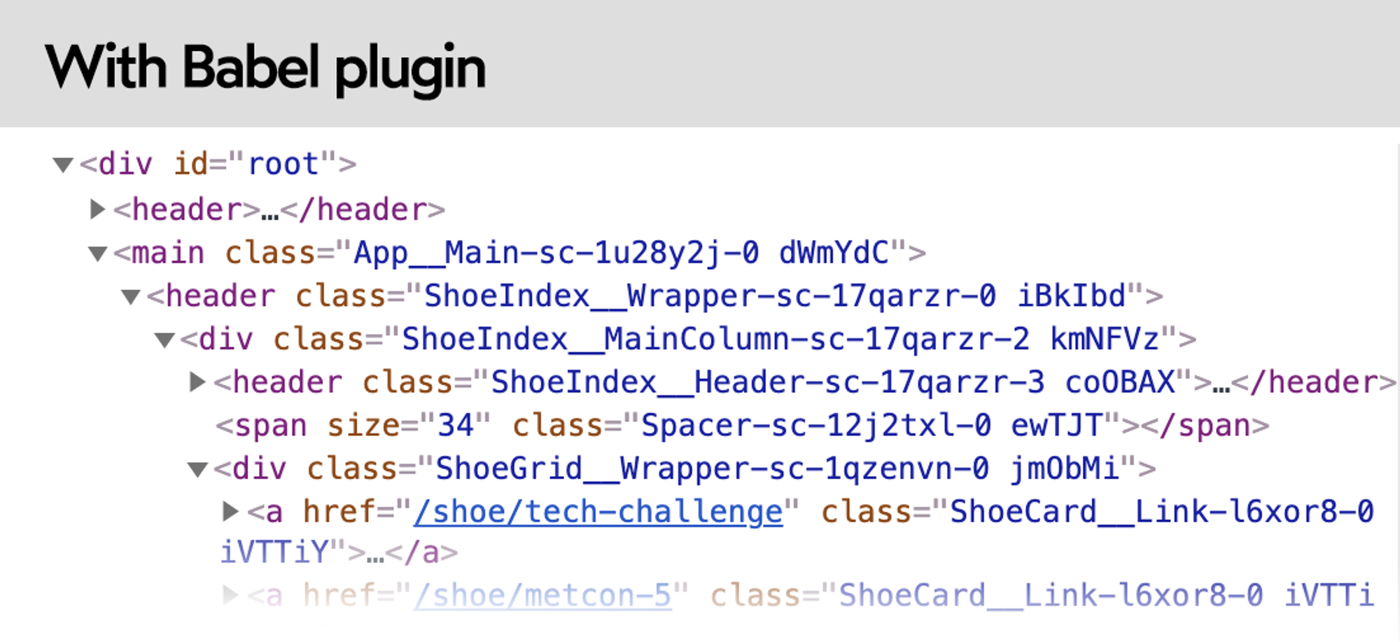
Babel 插件
为开发环境添加语义化类名
Filename_componentName_hash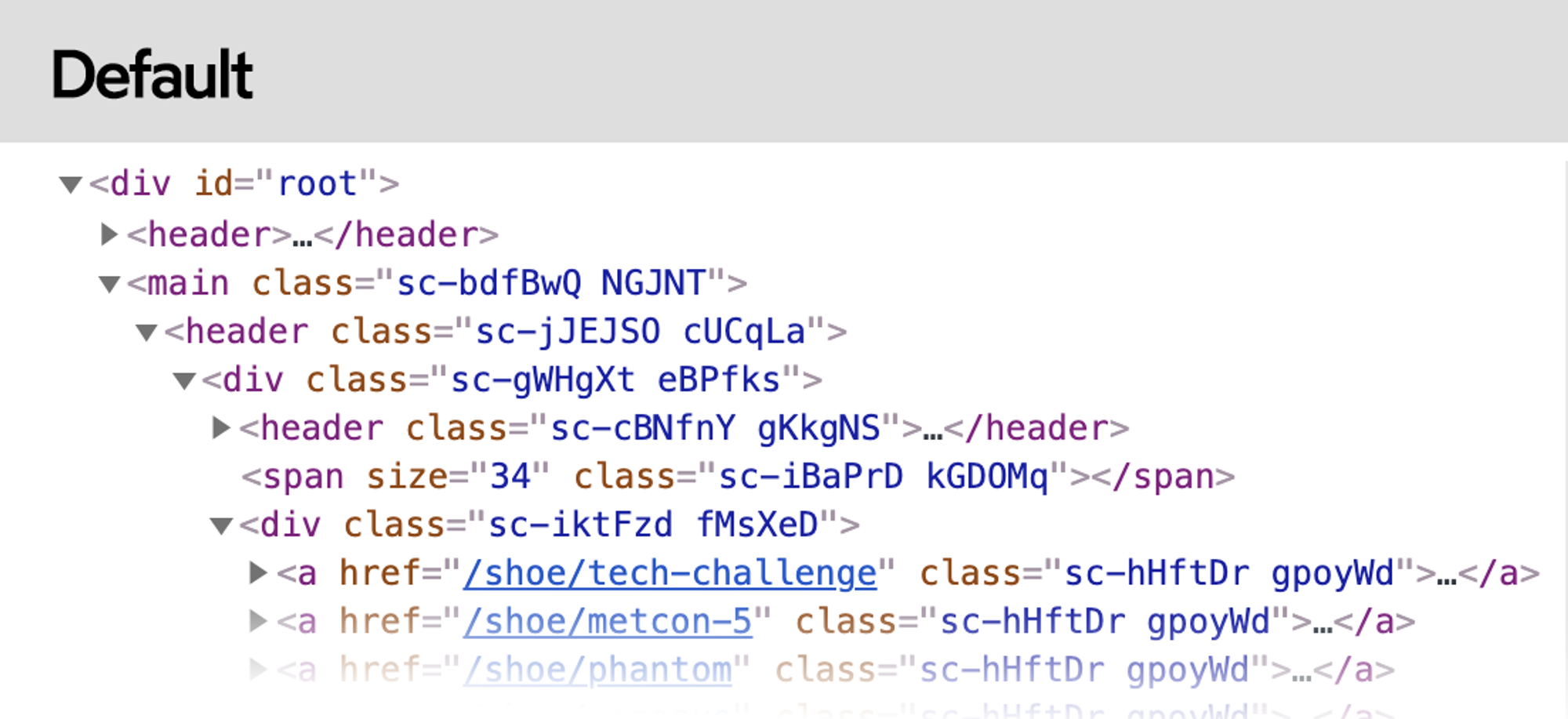
如果可以直接访问打包工具(Webpack, etc.)的配置,这样安装就可以了。
如果使用 Create React App,则需要 eject,或者:
In your React application, change all imports to match the following:
By importing from the macro, you get the benefits of the Babel plugin without needing to eject, or fuss with the build configuration.
在我实际使用中发现,此方法似乎已经失效。这是 ChatGPT 给出的解决方法:
Server-side Rendering
styled-components has server-side rendering support, which means the initial HTML/CSS is generated beforehand.
相关链接见课程
Global Styles 全局样式
GlobalStyles 模块被渲染时,会将内部的 CSS 注入到 <head> 中。该模块存放位置并不重要,推荐在
App.js 中引入并放在最后。Josh 有一套基于 Eric 版扩充的全局样式,详见视频
Dynamic Styles 动态样式
Inline styles
问题:
- 让组件的 CSS 变得割裂
- 与媒体查询、伪类等不兼容
Camel-case properties
Interpolation functions 插值函数(推荐)
CSS Variables CSS变量
附:简单的媒体查询例子
Component Libraries 组件库
这个模块适合您!你们中的一些人可能会想:“我不想构建一个庞大的开源组件库!我只是想改进我的 CSS 来构建小型 web apps. 这个模块能帮助我实现这个目标吗?”答案是肯定的!大公司用来构建组件库的方法可以让每一个 React/Angular/Vue/Svelte app 受益。通过思考我们用这些术语编写的组件,我们可以生成更好的应用程序。这并不意味着您需要启动一个完全独立的项目或开源任何东西。即使您的“组件库”是位于您的 side project 中的六个组件,本模块中的课程也适用。
Design systems and design tokens
附一篇知乎文章解释

对现成组件库的看法及本节目标
- 完全依赖现成的组件库很可能会发生这种情况:某个想实现效果在组件库里没有,并不是所有组件库都可以很方便地覆盖样式,动这些东西有时候会比使用自己手写的组件更加复杂耗时,等等。
- 话又说回来,现成的组件库在原型、MVP (Minimum Viable Product)、黑客松中很有帮助。尤其是你正在专注于功能的实现,而不是外观时,组件库可以大大减少工作量。
- 对于长期的企业项目、个人兴趣项目,Josh 都推荐编写自己的组件库。
- 我们并不要从零开始,Reach UI 是一块绝佳的空白画布,它帮我们解决了复杂的可访问性问题,又保持了接近零的最基础样式,可以在此基础上进行开发。
BreadCrumbs 面包屑导航
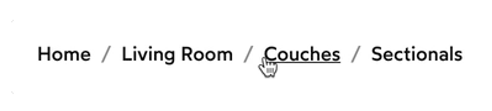
关键字:revert
撤销对样式所做的更改。
伪类 :not 和 :first-of-type
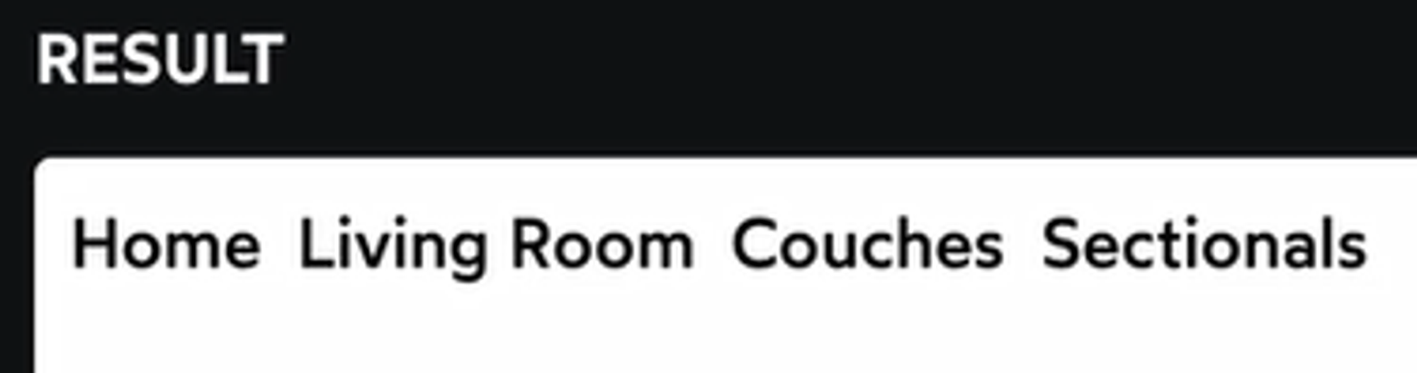
伪元素 ::before (:before)
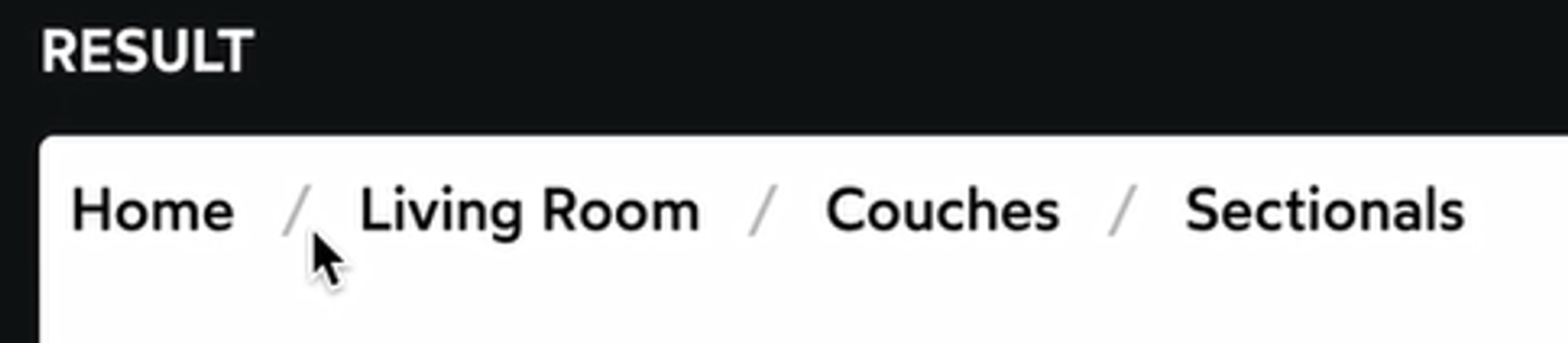
这里使用了层叠(nesting).
完整代码
Expand
Button 按钮 with Variants 变体 & States 状态
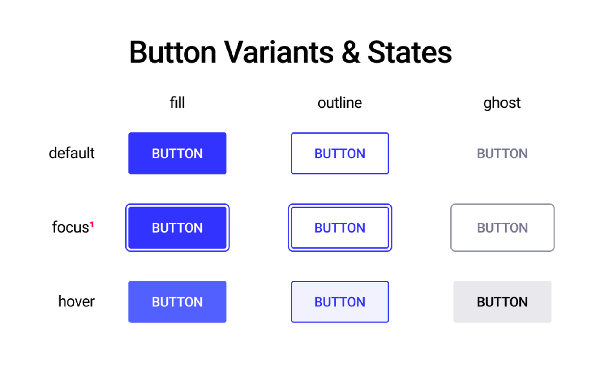
Composition 样式组合 | 使用 styled() 扩展已有组件的样式
使用
styled.button`` 方式创建的组件,可以通过 styled() 构造函数作为新组件的 base例如:
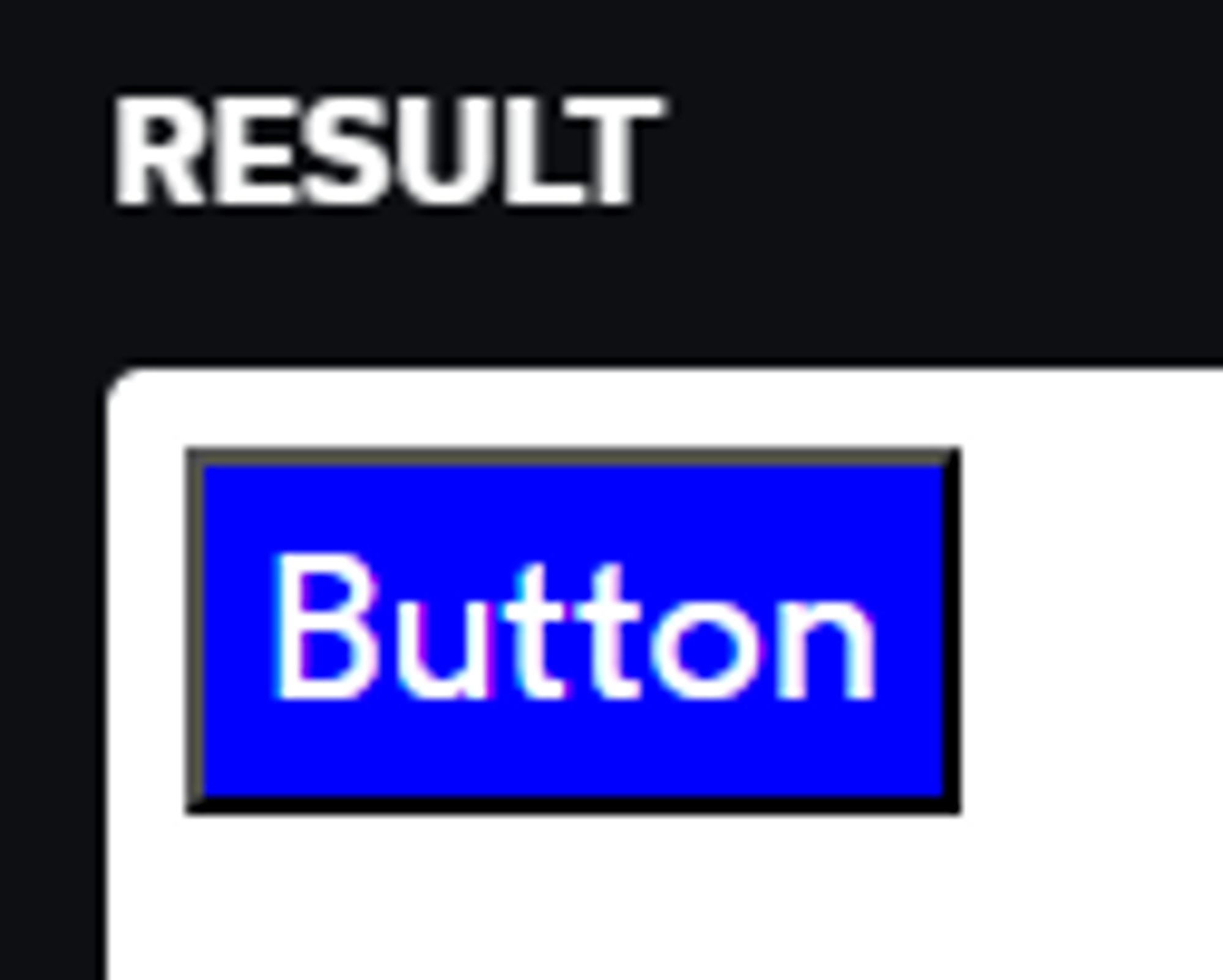
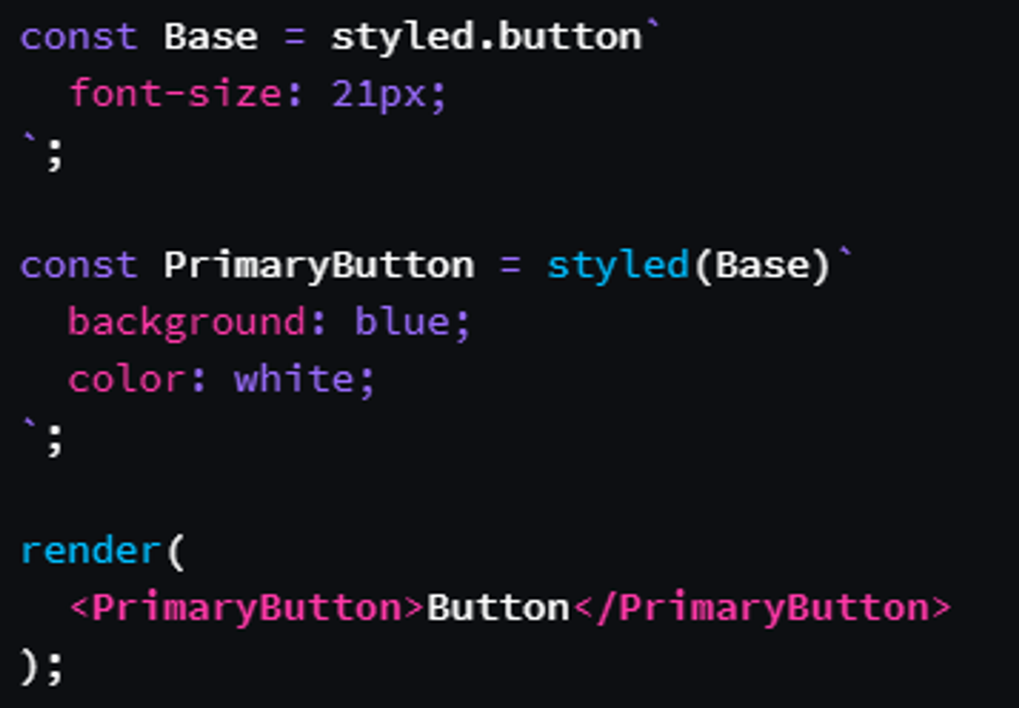
通过
styled(Base) ,PrimaryButton 获得了 Base 的所有样式,可以在其上进行修改。使用 CSS 变量实现不同状态
使用样式组合实现不同变体
将上面的
ButtonElem 抽象为 ButtonBase ,在此基础上覆盖样式,根据传入的 variant 渲染指定组件。styled(ButtonBase)完整代码
Dynamic Tags / Link Button 按钮链接
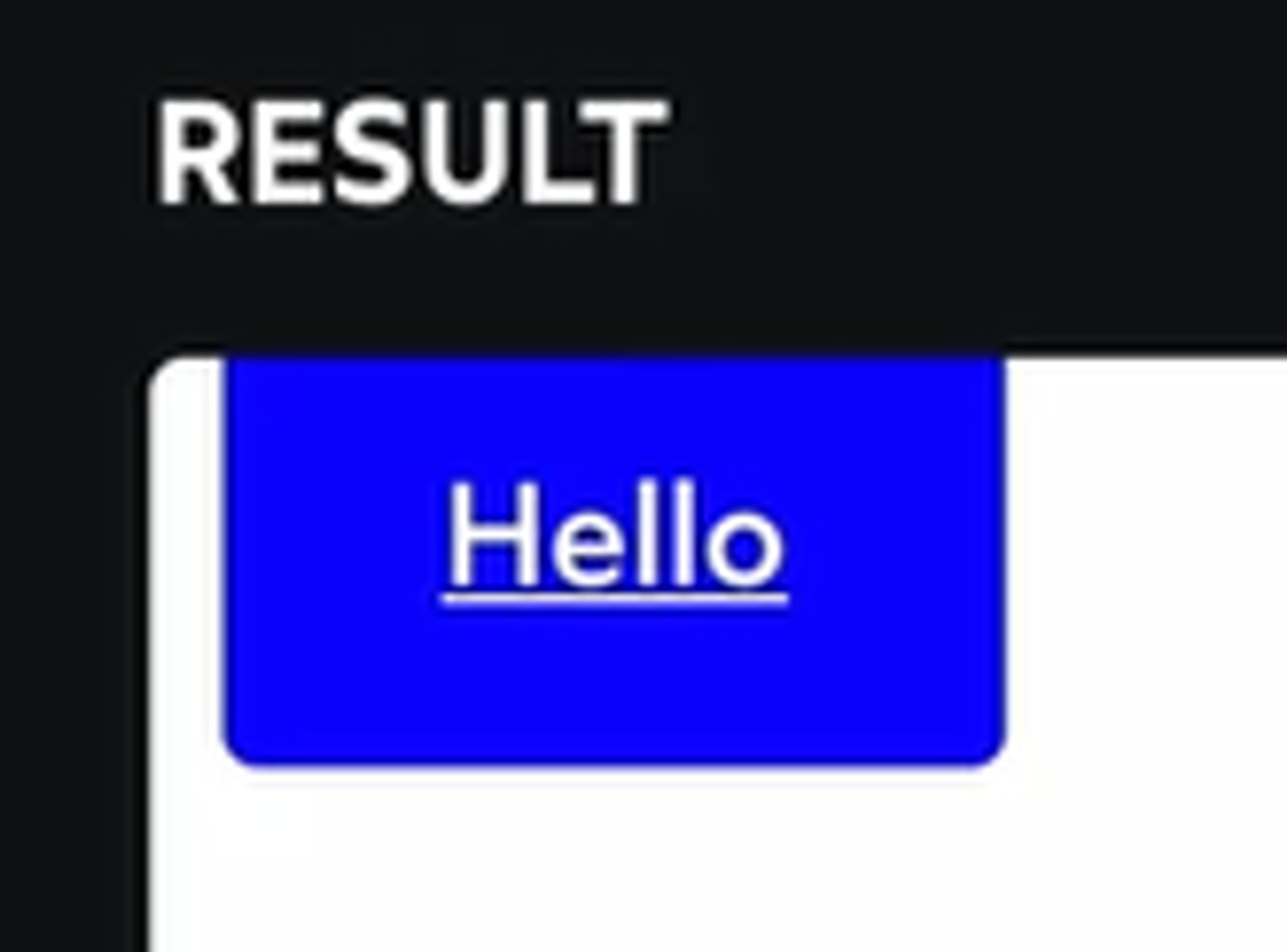
as 多态
根据是否有
href 决定渲染成什么 HTML 元素一个使用自定义组件
Link 的例子:Escape Hatches 逃生舱
styled() 扩展任意组件的样式
事实上,不仅 styled-component,对于任意的第三方组件,
styled() 也可以扩展其样式。要使其生效,组件需要能够传递 className. 以下是官方文档中的示例:为了将
styled() 生成的样式类名应用到实际的元素上,我们需要一种方式来传递这个类名。这就是 className 属性的作用。对逃生舱的看法
Essentially what we've done, by forwarding
className, is we've given ourselves an escape hatch. The React team intentionally adds friction because they want it to be clear that this is an escape hatch to be used in exceptional circumstances, not something you should reach for every day.Single Source of Styles 单源样式
样式的反向嵌套
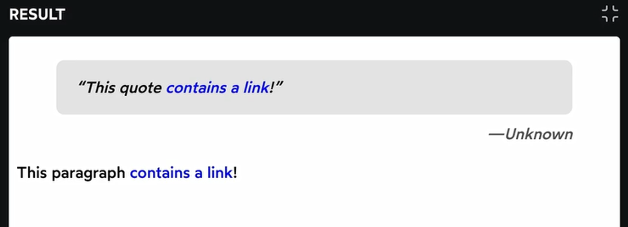
如图,
QuoteContent 和 p 里使用了同一个 TextLink 组件,效果是让链接文字变成蓝色。假如我想让 quote 里的链接换一种颜色(或者应用一些别的样式),而 TextLink 的实现又很复杂我不想写第二遍,有没有什么好方法?最简单的想法是给
QuoteContent 添加样式:这样确实能解决问题,但我们可以实现得更精确,从
TextLink 入手:后面这部分内容只有
TextLink 在 QuoteContent 中才会生效。这样做避免了第一种方法的样式泄漏(比如,我们无法确定 QuoteContent 里是不是还有别的组件渲染出了 a 标签)附:官方文档的一个例子,父元素在 hover 状态时变色